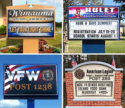
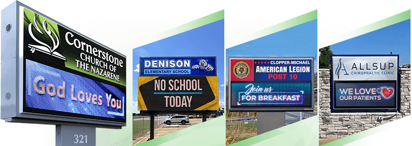
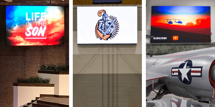
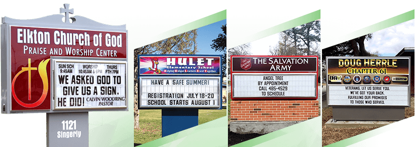
We've worked with thousands of organizations like yours, and have seen many examples of how a new sign has revitalized their communication. But how can you use technology to ensure that your sign will be seen and read?
-
Secret #1: Use movement to attract attention.
To be read, a sign must first be seen in a crowded visual landscape. Our eyes are naturally drawn to movement, and a brief video animation or slide transition effect will gain the attention of people going by.
-
Secret #2: Immediately follow it with your main message or call-to-action.
After the animation is where the heart of your message should be. These steps can also be combined by using moving backgrounds or text animation templates. You can even track the effectiveness of your message by using a custom website address, email address or phone number on the sign.
-
Secret #3: Keep it brief but memorable.
Depending on traffic speeds and conditions, you will want to keep the combination of movement and message to less than ten seconds. If positioned near a traffic stop, this will extend your viewing time. Regardless, make sure that you showcase the church's personality and leave your viewers with a message that they will remember.
-
Secret #3: Use scheduling to fine-tune your messaging.
Not only can you schedule specific messages by date, but you can even schedule them daily or weekly at specific times. Event announcements should always have a scheduled end date set in the software to prevent your message from showing up after the event has occurred.
-
Secret #5: Use different messages on a two-sided sign.
Most two-sided signs are positioned to have a side that is closer to traffic and one that is farther away. Use larger and bolder text for messages on the sign positioned farther from traffic. With less text, you can also shorten the amount of time each slide is on the sign.
What message will you put on your sign?
