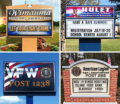
If you have an outdoor digital LED sign - or if you've been thinking about getting one - this is going to be a great article for you! In order to provoke engagement from people passing by, you'll need two key elements: content and form. We've compiled ten tips to assist you in your journey to getting effective results from your outdoor digital LED sign. Check them out!
1. Colors Matter
Choosing contrasting colors is best practice. Some examples of contrasting colors might include:
- Yellow and black
- Dark blue and white
- Red and white
- Green and white
Really, any color combination that's light and dark will work well and allow your message to be pronounced and crisp when your audience reads it. For consistency, it's a good idea to match the colors of your LED sign with your branding and logo.
2. Location Matters
It's important to make sure your sign is as close to the street as possible to maximize exposure. After all, your outdoor digital LED sign is important real estate, and we all know what Realtors say: location, location, location! Choose the proper shape and size to ensure there are no obstructions blocking the view of your sign. The last thing you want is to invest in an incredible sign nobody can see because there's a tree standing in the way! It's a good idea to view your sign's potential final destination from a different angle; drive by a few times with your eye on the prize to see if other passersby will have easy access to your message. If you're on the fence, chances are, it may not be the right place to position your outdoor LED sign. Pro tip: Aim high for maximum exposure!
3. Size Matters
It's extremely important to make your sign as easy to read as possible. Your font should be big enough to read from any side of the street. Here's a good rule of thumb when it comes to sizing your outdoor digital LED sign: for every 10 feet of viewing distance, your letters need to have one inch of height. For the easiest read, go for a mixed-case sign, incorporating capital and lower-case letters, as opposed to all caps. The amount of "white space" you have on your sign is also important. For most outdoor digital LED signs, you want to leave about 30 to 40 percent of the sign untouched; this ensures the sign is free of visual clutter and easiest to read.
4. Creativity Matters
Try using your imagination when creating unique messages on your outdoor digital LED sign. This is your opportunity to spur warm feelings with kitschy sayings that resonate with your audience. You only have a few characters to make a big impression, so let your creativity guide the way! Boring messages are for everybody else. You've got thought-provoking messages in your mind; now is the time to unleash your wordsmithing powers! Remember, you can change your LED sign's message at a moment's notice, so go crazy, and let the creativity flow free.
5. Length Matters
The number of words you use on your sign will matter. On average, an adult can read about 250 words per minute (or four words per second). When crafting messages, be clear, concise, and to the point. Aim to keep the headline around three to five words. It's a trying task, but successful organizations know the fruits of these alphabetic labors! The more concise your message is, the more success you'll have. Edit your copy to the point it makes sense without using unnecessary words.
6. Benefits Matter
Of course, you know the message you're delivering is awesome, but why should anyone else care? People today don't have a ton of time or patience; they need to know what you're offering, how your organization can benefit them, and why they should want to learn more. Use your outdoor digital LED sign's real estate to appeal to your audience by using words that resonate with them while keeping your organization's values in mind.
7. Urgency Matters
If you really want to get people's attention, create a sense of urgency. Need some ideas? Try:
- Creating a special price for a limited time
- Advertising an exceptional event
- Letting people know about offers they'll only be able to experience if they act right now
Your outdoor digital LED sign has all the elements necessary to create a sense of urgency.
8. Context Matters
Use logos and phrases relevant to your industry, company, or pop culture to bring awareness to your messages. Context helps people understand messages quickly; your audience is more likely to act when it can relate.
9. Personalization Matters
Use words like "you" and "your" in your messaging. Second-person narrative speaks directly to the reader, helping your organization relate more intently to your audience.
10. Boasting Matters
Why is your organization the best choice for your audience? Why would someone want to act on your offers? Make sure you boast about your competitive advantages. After all, that's what makes you stand out above the other guys. Tell people about your ratings; share your designations; boast about your ability to bring people a positive experience.
These are just our top ten tips for outdoor LED signs, but there are plenty more reasons to make this form of messaging part of your marketing plan. We invite you to reach out to our Stewart Signs team today. We'd love to show you an artist's rendering of your new outdoor sign along with your personalized quote, free of charge.
